How your Eyes See Websites
Have you ever opened websites and wanted to shield your eyes from its combination of colors and images? Or perhaps you’ve opened a page and found it very hard to read because of the placement of photos or a color scheme that is too light.
Did you know there’s a science behind it all?
It’s called the “science of readability.” Though it’s been around in marketing and advertising circles since the 1980s, web designers and developers are now use the concept when creating websites.
Here are a few interesting examples to take note of next time you are browsing the web.
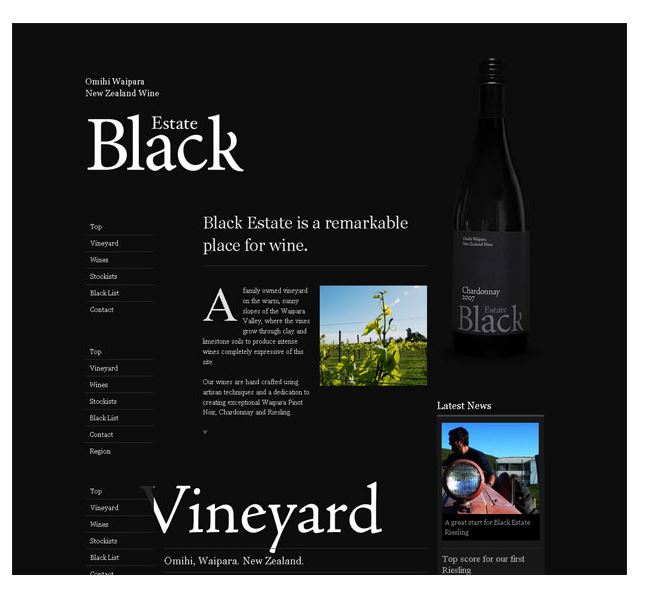 Dark Text on Light Background vs. Light Text on Dark Background
The science of readability says on a website, dark text on a white background will trump light text on a dark background. This has to do with how the eye sees contrast and also has to do with people who have astigmatism. Almost half of the population has some sort of astigmatism. Some say that a bright white background forces the iris to close a little more and decreases the effects of the astigmatism. Dark backgrounds allow more light into the iris and can turn blurry – almost magnifying the effect of the astigmatism.
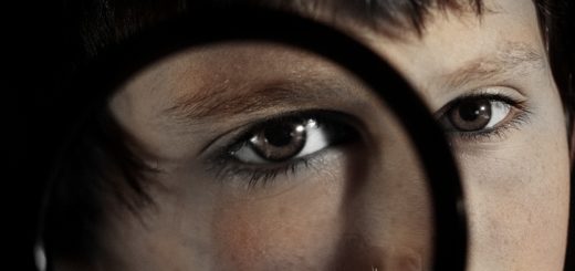
Images & Photos
We are an image driven culture. We love to look at pictures. If websites have too many images scattered everywhere, it can be over-stimulating for the eyes. Our gaze needs to be lead in a distinct pattern based on the content. A good website layout of images and text will lead you through a page easily, but a poor layout will leave you frustrated – visually and otherwise.
 White Space
On the other hand, our eyes don’t like to be bored. A page of solid text with a lot of white space around it is a visual bore on websites. We can barely keep our eyes opened to read an article or figure out what the purpose of a site is when this is the case. Too much white space may also be tiring to look at because of its brightness. Don’t go in the totally opposite direction and add too many images or photos that will distract the eye.
Next time you’re online, take note of how your eyes feel as you browse. You just may experience the science of readability first hand.